
(Hi, I’m Andrew and I run & Pens. Welcome to my new weekly column Strange Notes.)
(Hi, I’m Andrew and I run & Pens. Welcome to my new weekly column Strange Notes.)
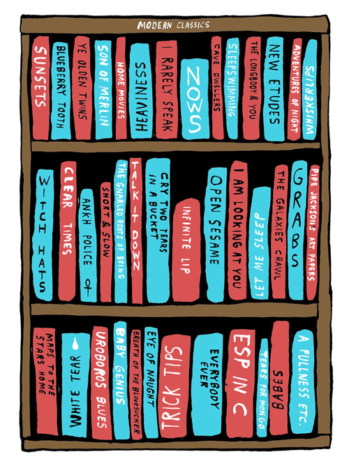
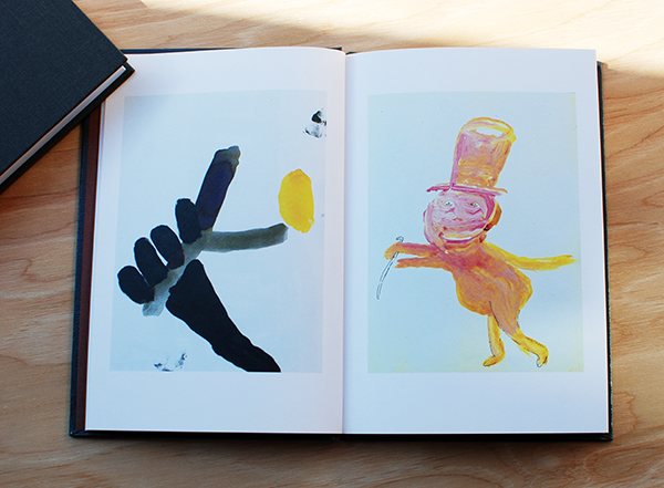
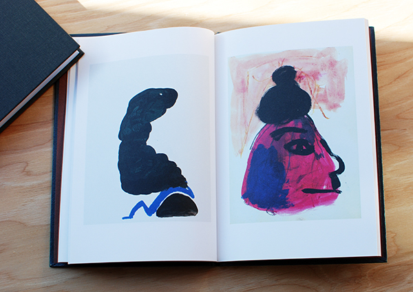
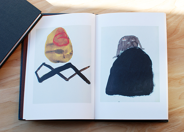
Here we are with our second ever interview on this bloglog. For this special installment we have shared words with one of my favorite guys working out there, Nathanial Russell. This super positive gentleman is a jack of all comedic and psychedelic trades with paint, pencil and all mediums in between. In 2012 & Pens Press published his Public Notice zine, a hilarious zine that you should check out if you haven’t yet, it’s guaranteed to inspire a good crack up.
So here we are, let’s jump right into things:
&P: Name and location?
NR: Nathaniel Russell Indianapolis, Indiana, USA, Earth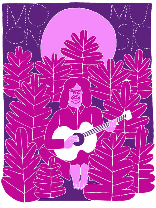
&P: You’ve been busy this summer, tell us about some of the projects you’ve been working on.
NR: i had an exhibition of my fliers and short videos at the Indianapolis Museum Of Contemporary Art in June. it was the first time i’ve shown that body of work in a gallery setting and i think it worked pretty well. the iMOCA and Service Center were very supportive and really made the whole thing happen.
-i was part of a group show curated by Evan Hecox at Joshua Liner Gallery in new york that i went and checked out. i got to see some good friends and meet some new people, too, which is always the best part of these kind of things.
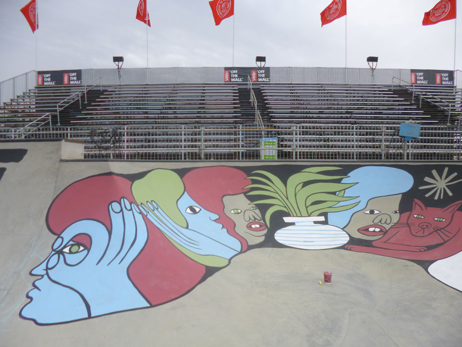
-i went to Huntington Beach to work on the bowl for the Van Doren Invitational, a skate contest put on by Vans. they built a cement bowl on the beach during the US Open Of Surfing and 5 artists, including myself, got to paint it up. it was exciting for me in one way because i got to meet or be in close proximity to so many people i have admired since i was a kid, people who had a real effect on my path in life. the best part, again, was meeting and working with such a great group of artists and the good people who work for vans. it was a family affair.
-i’m helping with the graphic side of things for the Mollusk Jamboree that’s taking place in Big Sur in September. i made the poster, some new shirts, and my band will be playing at it.
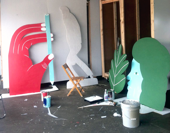
-i’ve been working on a series of wood cut-outs for the Service Center here in Indianapolis off and on all summer. the cut-outs will be in their community garden and all around the exterior of the building. we’re working up to an event in October and it should be pretty fun.
-just finishing up recordings for a record of songs this week. pretty psyched about it. i’ve been hanging out in the basement recording drums and singing and it’s been a real treat. it’s great when that feeling comes around and you can really grab it and enjoy it for a while.
-in the midst of all this i’ve worked on some freelance-y commercial jobs and some collaborations with some of my favorite artists that should see the light of day this fall and next year sometime.
when it’s written down it all sounds like it’s way too much, but i really don’t feel that much busier than normal. i’d rather be working on something than not, but i’m working on that.
&P: That’s all sounds fun and pretty inspiring. You work over many diverse platforms, do you have a favorite way of working?
NR: it all comes from the same place. i think i need a balance of forms. it’s good to work big, like on a mural, and then work small, or to see something you thought of as small become large. i like to see things grouped together, in a context of themselves, and that lends itself to books and zines. i think the root of it is i like so many ways of making things: drawing, painting, collage, writing, books, sculptures, records, murals and i just want to do all those things. whether or not anybody wants to see them or that i am successful in the making of them is another story but one that is less important than the actually making of the thing.
&P: We love your the zines & publications, do you have a new one in the works?
NR: i have one brewing, i think it’s been brewing for a while. i think it will be more like a book: longer and a bit more deliberate. i would say 2014 if we’re being realistic and optimistic.
&P: Looking at all the lists you post from your sketchbook what would your list of the “Top 10. Most Amazing Lists” look like?
NR:
1. records/books i should get that i have not heard of or should reconsider
2. ways to be rad in every day life
3. what to make for dinner
4. best words to use right now
5. top ten people that want to give me a cabin in the woods in northern california or ojai to live in
6. cool dogs
7. secret chords
8. trick tips
9. painters that everybody sleeps on
10. cookie recipes
NR: right now i’m finishing up a bunch of miscellaneous illustration-y stuff, some reissue LP designs, and in the beginnings of what i hope will be a new group of things for an art show. my hopes for the future are: that i get my music recordings made into the vinyl format and sent out into the earth, that i do a new show of some new work in the near future, and that i continue to be able to make things as i like them and for them to be appreciated on some level. i just want to stay busy and healthy and try to do the best stuff i can.
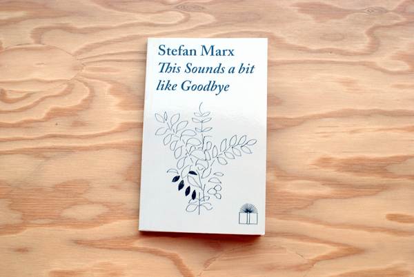
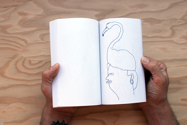
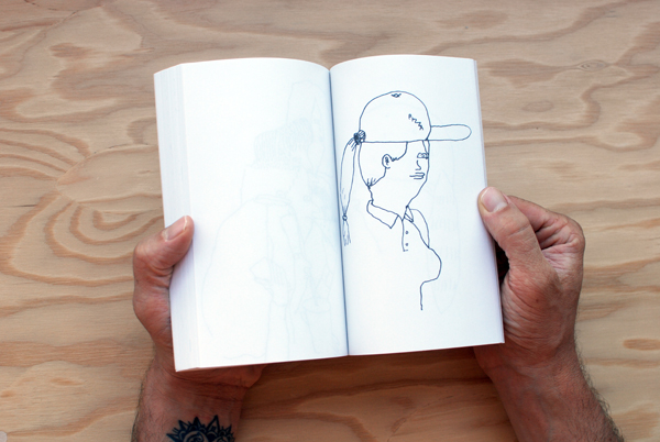
This Sounds a bit like Goodbye
by Stefan Marx (Hamburg, Germany)
Stefan Marx‘s latest and greatest publication, This Sounds a bit Like Goodbye, is a continuation of his travel drawings of the people and places he visits.
 For this series New York was his host.

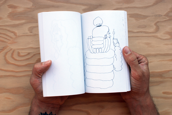
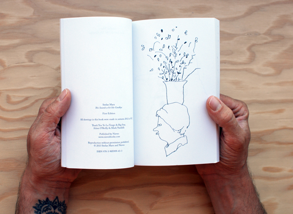
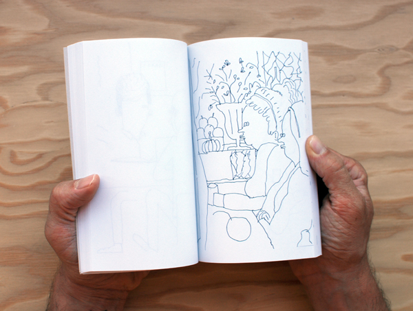
Over the course of 156 pages paperback pocket-sized book, Stefan’s quick and gestural portraits depict shops, sceneries and funny impressions of individuals. You can tell the energy of the characters are sometimes done in just a moment while others seem like he had time to sit and revel in the details of his surroundings a bit more.
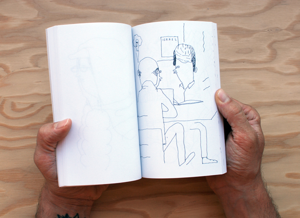
This Sounds a bit like Goodbye is Stefan Marx’ 16th publication with Nieves. We are hoping he travels to LA for his next one.
Available in the Bookstore here.

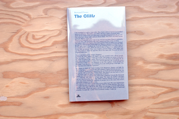
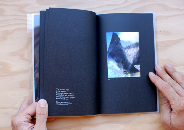
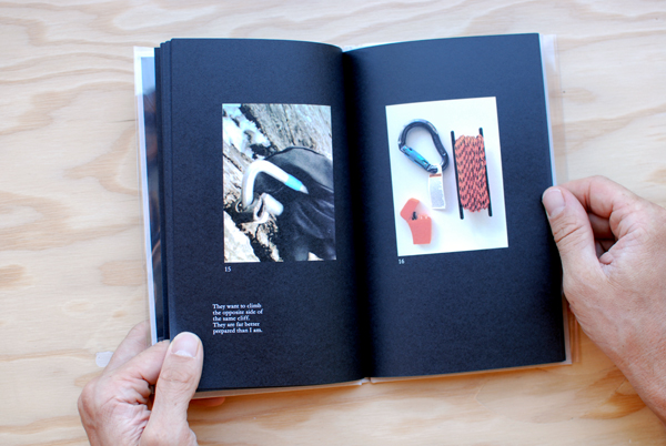
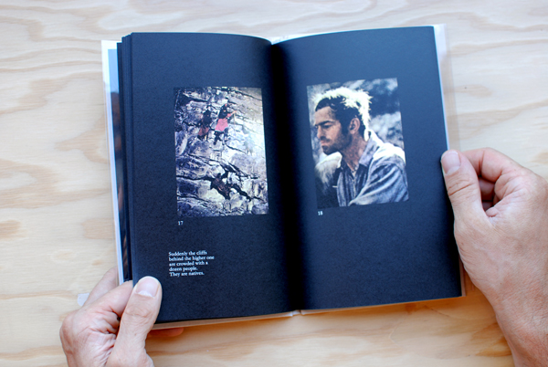
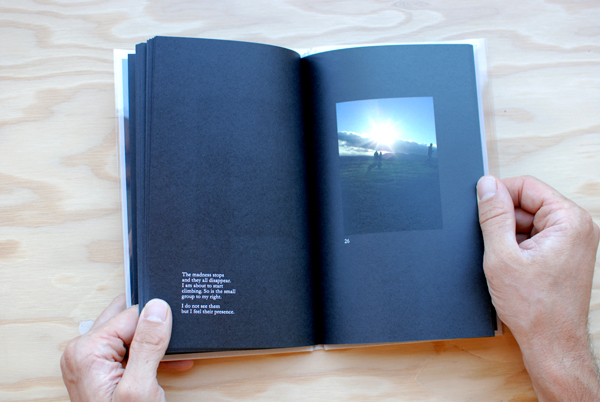
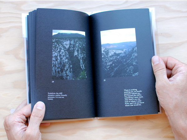
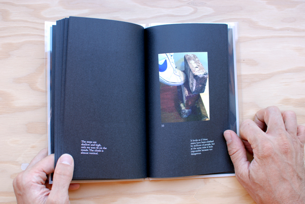
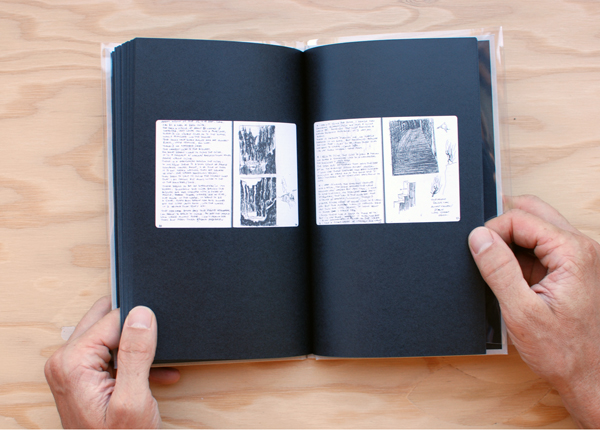
Since we are a little belated with our blog posts from the holiday weekend we decided to combine Monday Meditations and Poetry Tuesday by introducing an inspiring and unique book that represents both worlds: The Cliffs by Bertrand Fleuret.
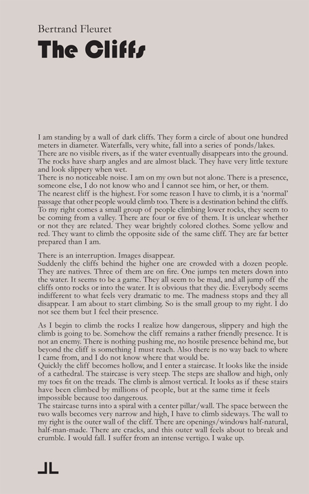
French photographer Bertrand Fleuret, born in 1969, is a maker of beautifully produced photo books. The Cliffs, published by JL Books, continues the exploration of his earlier work in Landmasses and Railway’s by combining imagery and imaginary worlds, leading the viewer through surreal pathways with poetic narrations.
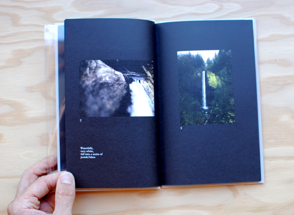
The inspiration behind The Cliffs was to reconstruct a vivid dream of Fleuret’s that began with him standing by a wall of dark cliffs. When he awoke from the dream he still found the imagery completely vidid and compelling even after being long awake. The collection of color images and written accounts of the dream reproduces the sequence of events he experienced both awake and asleep.
Available here.
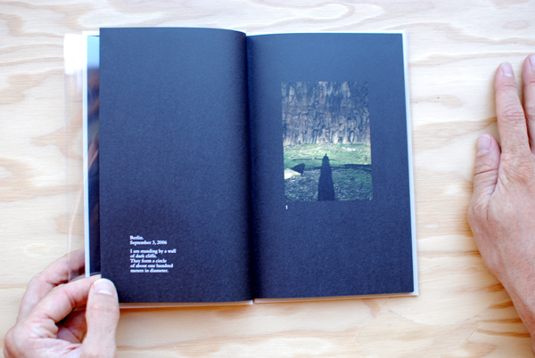 “I am standing by a wall of dark cliffs. They form a circle of about 100 meters in diameter.”
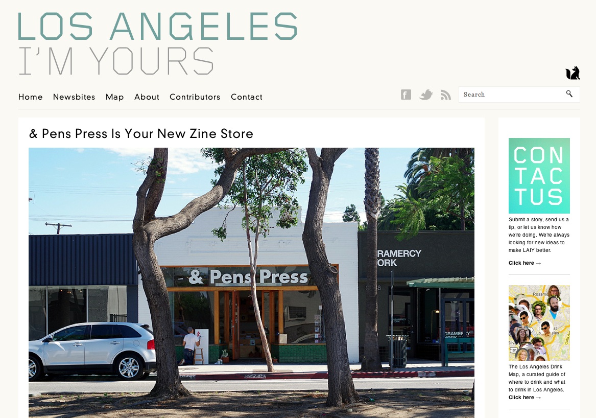
A big thank you to Kyle over at LA I’m Yours for the lovely blog post about & Pens Press! We are stoked to be in LA and couldn’t agree more that zines are having a rad moment right now. Vive la printed matter!
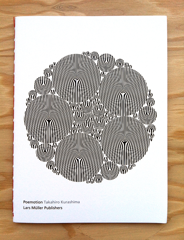
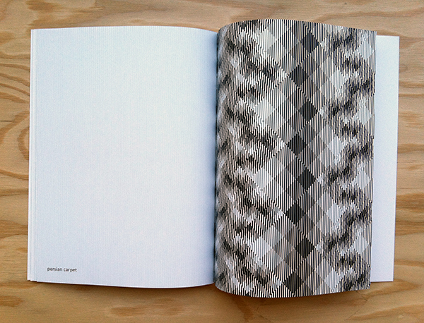
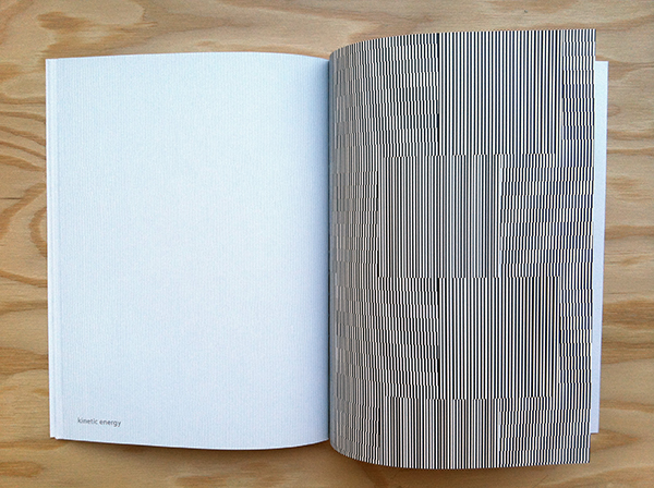
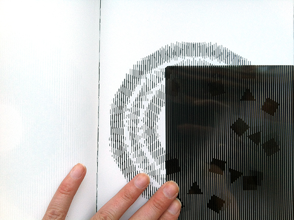
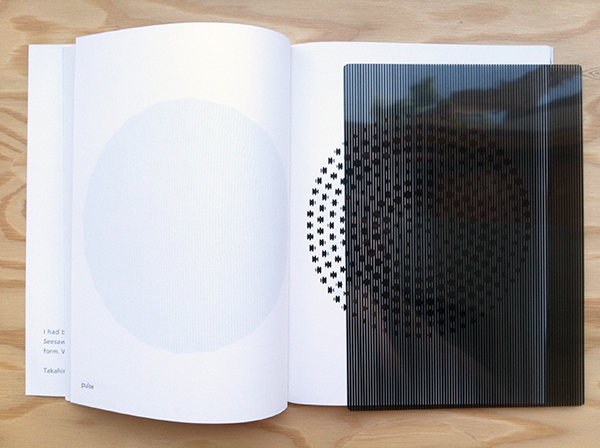
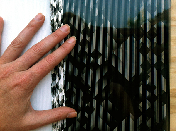
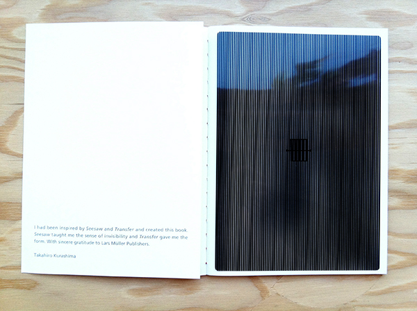
Yesterday we were excited to open a new shipment and find Poemotion had arrived! This beautiful soft bound interactive book features a collection of graphic patterns, hand drawn by Japanese designer Takahiro Kurashima. These drawing are magical as they have the capacity to delight and bewildering viewers of all ages.
Following the theme of “School of Seeing”, a motif that resonates throughout Lars Müller publications, Takahiro’s book explores the ways in which optical overlays, patterns and shapes can create motion.
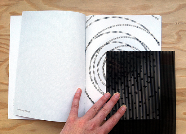
By sliding the screen included in the book across the pages the viewer activates a moiré effect, allowing for complex forms to develop by setting shapes in motion and graphical patterns to vibrate.
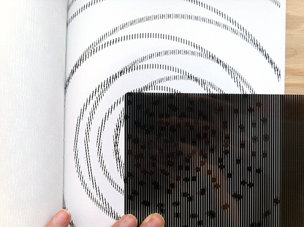
In the era of digitalization this book shows that interactivity is also possible in the format of an analogous, bound book.
Available in our analog bookstore or online here.
Here is a great video demonstration of Poemotion we found from PORT on Vimeo. Directed by Nick Thompson, edited by Neil Drummond and with music by John Barber
[vimeo http://vimeo.com/40808542]
For this week’s post of Tuesday Poetry we decided to highlight a zine tribute to the inspiring poet, Harold Norse.
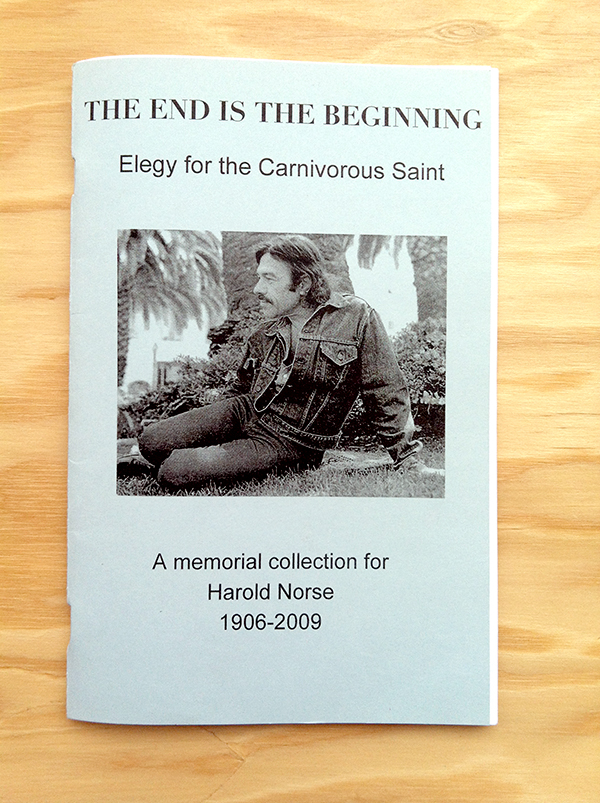
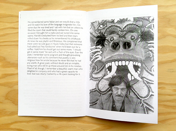
Harold Norse was one of the last of the major Beat poets whose idiomatic works became landmarks of gay writing. As Michael Carlson described, Norse was “…beat before the Beats, hip before the hippies, and out of the closet long before gay liberation.”
Paul Bowles
Neeli Cherkovski
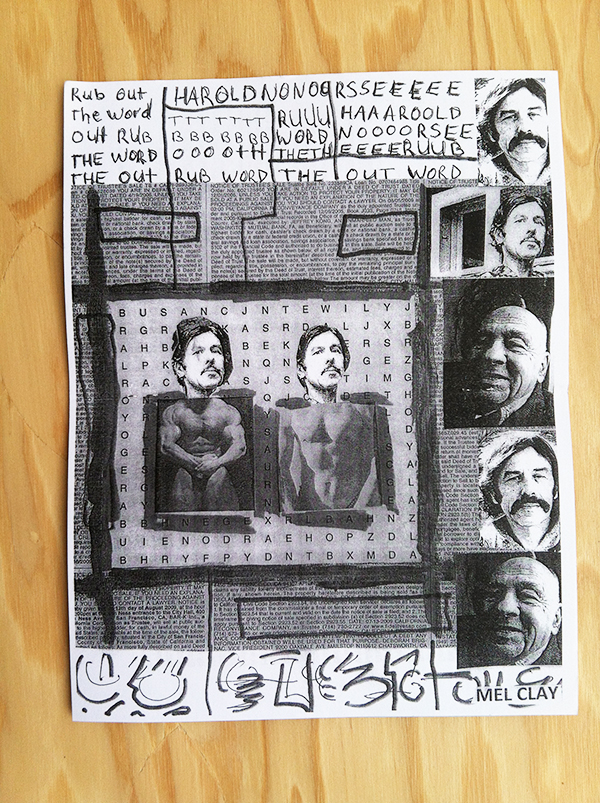
Mel Clay
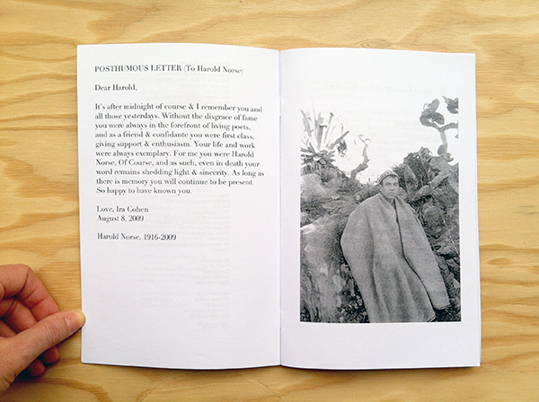
Ira Cohen
Jack Hirschman
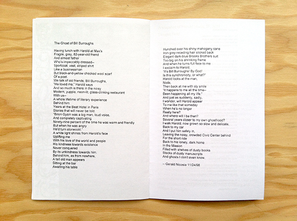
Gerard Nicosia
A.D. Winans
Eddie Woods
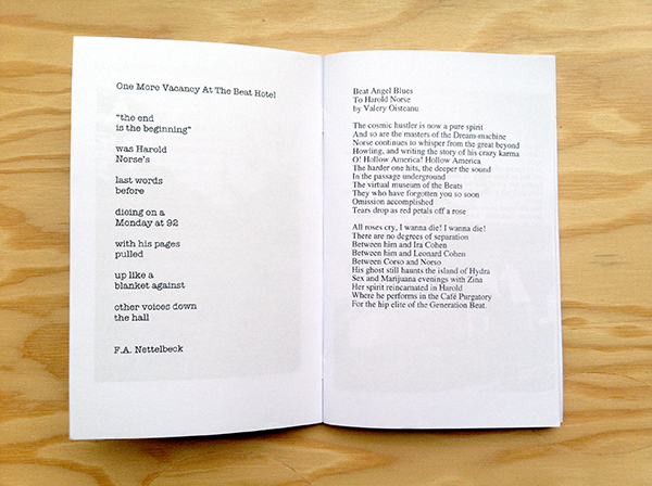
In F.A Nettelbeck’s poem “One More Vacancy At the Beat Hotel” he writes:
“the end
is the beginning”
was Harold
Norse’s
last words
before
dieing on a
Monday at 92
with his pages
pulled
up like a
blanket against
other voices down
the hall
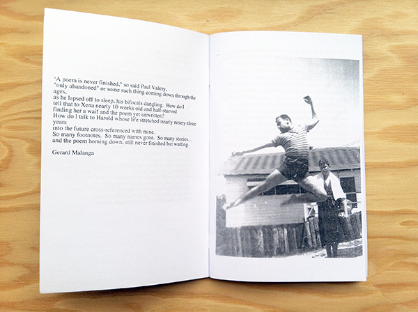
The dedications of love and admiration are for any fan, or first time encounterer of Norse’s, amazing to experience. Many of the stories shared shed light on his electric personality and allow you to peer briefly into the scared world shared by beat poets. Their relationships served as inspiration for generations beyond their’s and you can feel the loss in the words written to or about Norse in these pages.
When you pick up a $4, black and white xeroxed zine and it makes you emotional, inspired and curious to learn more you know you have encountered something special. After reading through The End is the Beginning I delved into Norse’s memorial website which is filled with memories, photos, books and records. If you want to learn more about Norse I encourage you to visit: www.HaroldNorse.com
Elegy for the Carnivorous Saint available in the bookstore here.
Not included in the book, but something to share of Norse’s, is a poem from his time in Tangier recalling the visions and ecstasies shared with his young lover.
To Mohammed On Our Journeys
I was the tourist
el simpatico
and your brother offered you
and also himself
I forgot about your brother
and we took a flat in the Marshan
with reed mats and one water tap
about a foot from the floor
and we smoke hasheesh
and ate well and loved well
and left for the south
Essaouira, Fez, Marrakech
and got to Taroudant
thru the mountains
and bought alabaster kif bowls
for a few dirhams and watched
the dancing boys in desert cafés
kissing old Arabs and sitting on their
laps, dancing with kohl eyes
and heard the music down in Jejouka
in the hills under the stars
the ancient ceremony, Pan pipes
fierce in white moonlight
by white walls
with hooded figures
stoned on kif
for eight nights
and the goatboy in a floppy hat
scared us, beating the air
with a stick, beating whomever came close,
Father of Skins, goat god,
and the flutes maddened us
and we slept together in huts.
Festus, by Canadian artist and illustrator Jason Logan, is another gem published by J&L Books that we are particularly stoked about having in the & Pens Press shop currently.

Published in 2010, this handheld hardcover publication depicts the classic figure of the frontiersman in various incarnations.
Logan made these works while traveling to the Klondike Institute in the outer reaches of Yukon, by the Alaska border.
Loose, colorful and confident, these thirty-five variations on the frontiersman carry through the book in different forms as the hustler, magician and logger just to name a few. Feeling like a mixture of incantations and studies Logan’s characters feel simultaneously iconic and refreshing. He’s traveled in his own path and loving this work feels like rooting for the underdog.
Available in the bookstore here.
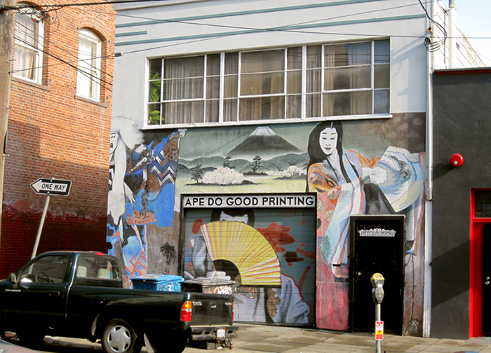
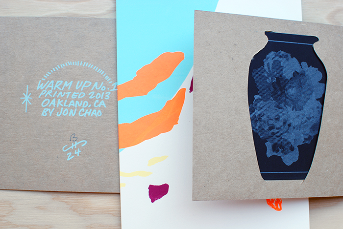
Please welcome our first featured artist on the blog Jonathan Chao from Oakland, California.
Jon works at Ape Do Good Printing, an artist run commercial silkscreen printing shop in the Mission district of San Francisco, while also independently producing his own beautiful silkscreen zines and projects. Curious to get to know more about his process, motivation and upcoming projects we asked Jon to tell us a bit more about himself.

&PP: To start, can you tell us about how you began making zines and doing what you do?
JC: I am a printmaker that makes art zines/books. The zines, notably Warm Up, are experiments with the screen printing medium and the book format. My recent focus has been leaning towards abstraction with a focus on pattern work. I recently started screen printing and making art zines towards the end of 2012, but before that I was attending UC Santa Barbara for art. At Santa Barbara I was formally trained, but it wasn’t till the end of the school that I decided to pursue self-publication and focus more on printmaking. I recently picked up screen printing so I still feel pretty fresh to the medium, but at moment I have been thinking about creating film positives with analog means. As for art zines/books I am digging into the community and finding something I really enjoy; there’s so much there that it’s exciting to follow.
 I spend a lot of time around screen printing so thinking about it in relation to my art is inevitable.
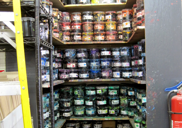 I try to take notice of colors that catch my attention when I’m around the shop. This helps me produce some interesting color schemes.
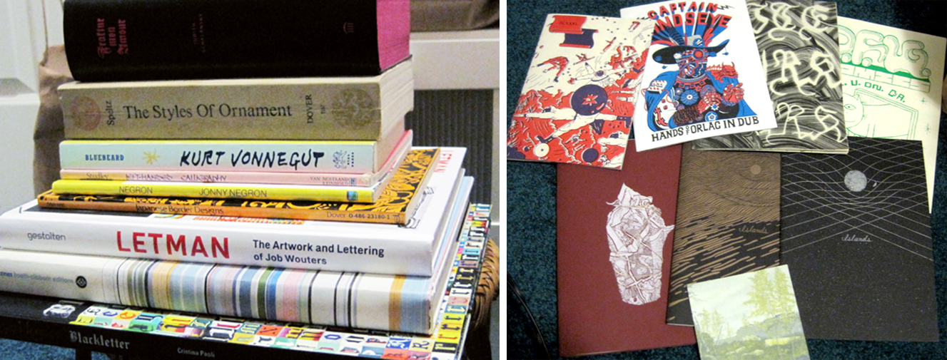
Here are some of my favorite zines and books in my collection. My most recent favorite find was Lite Murk by Cody Hoyt, printed by Visual Field Press. That Letman: The Art and Lettering of Job Wouters and Fraktur Mon Amour are also such awesome books.
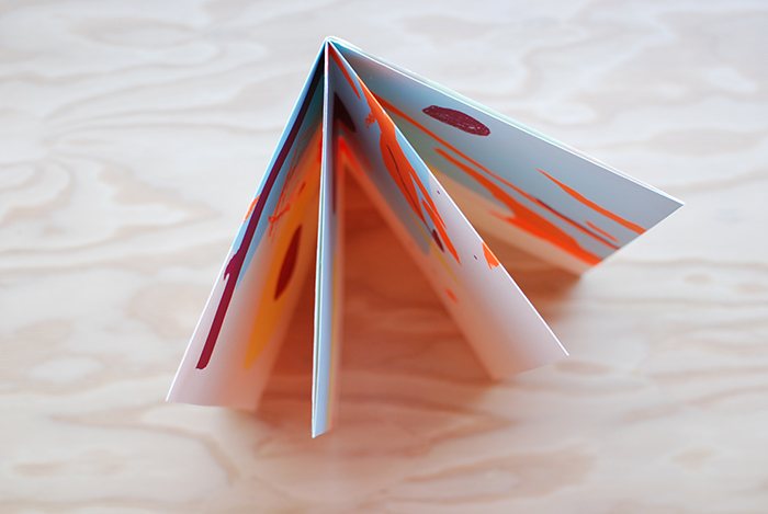
 &PP: We love your latest publication Warm Up, it’s beautiful. Care to walk us through your inspiration and process?
JC: The origin of Warm Up was a result of making mock ups for an 8 fold zine. It was with an old page covered with practice marks and strokes. I noticed how nice certain areas looked when focused from the full page. That event lead to the inspiration for the Warm Up series.
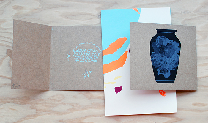 As for the process of composing the image, I created each layer as I went along and the process came organically. I experimented with making film positives through analog means and observed how certain materials and marks reacted when burned on the screen. I was curious about the results.
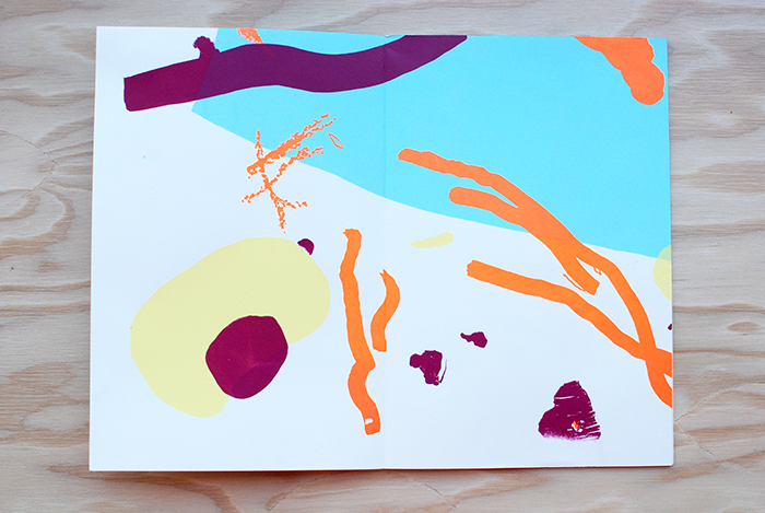 When preparing for Warm No. 1, I worked things out in my head and made preliminary thumbnail sketches. I hoped for the best when I printed, but left myself open to uncertain results and reactions. It was a real surprise with every layer, because I was loose with registering the different layers. Even more surprised was when I finished folding the finished print into an 8 fold zine. I thought it was interesting that I was working from a large image that would later on be turned into a series of smaller images. It was kind of a backwards way of working. I recently realized, as the maker of Warm Up, I was working to find out what the larger image will turn into as it is folded. Whereas, the viewer is working his or her way from the small folded image into the large unfolded full image. I like that.

&PP: What are you working on right now or have coming up in the future that you are looking forward to?
JC: In the near future you can expect two more different Warm Up editions. They will both be within a similar style of Warm Up No. 1, but focusing on different techniques in making screen positives. Then after the editions, I’ll dig through my sketchbook for the next project, which will most likely be some kind of print. My mind set has been geared towards screen printing since I’m around it so often. I’m excited to see what happens later.
&PP: Thanks for your time Jon, we look forward to seeing your new projects!