New & Pens Press title: What A Time To Be Alive by Joakim Ojanen

Joakim1

We are proud to present our newest title: What A Time To Be Alive by Joakim Ojanen – a full color, 60 page, perfect bound, glossy book published by & Pens Press in conjunction with Ojanen’s exhibition “New Paintings and Ceramic Work” at Richard Heller Gallery. Book available online and at our local LA annexes. *ONLY 300 MADE.

Joakim5
Joakim6
Joakim2
Joakim3
joakim7

Selected Press:
“Joakim Ojanen: Innocence and melancholy, sculpted into old souls and teary dogs” – LA TIMES
“5 Questions with Joakim Ojanen” – Elephant Magazine

SFAQ Issue 14 Release Party this Saturday

1173761_585075964873185_1363483823_n

Come on down to &Pens for our unofficial grand opening event this Saturday night 6-9pm
“SFAQ [International Arts & Culture] is pleased to announce a release party for Issue 14 in Los Angeles at the brand new &Pens Press Gallery and Bookstore, from the owners of Needles & Pens in San Francisco. Musical Performances curated by Tyson Vogel of Two Gallants.”
Issue 14 includes: Paul Schimmel, Ryan McGinley, Don Ed Hardy, Mark Flood, Robert Bechtle, Hijikata Tatsumi & Buto, Bonnie Ora Sherk, Sandy Kim and much more.


Hand Drawn Magic

IMG_8247

IMG_8252 IMG_8251

Yesterday we were excited to open a new shipment and find Poemotion had arrived!  This beautiful soft bound interactive book features a collection of graphic patterns, hand drawn by Japanese designer Takahiro Kurashima. These drawing are magical as they have the capacity to delight and bewildering viewers of all ages.

Following the theme of “School of Seeing”, a motif that resonates throughout Lars Müller publications, Takahiro’s book explores the ways in which optical overlays, patterns and shapes can create motion.

IMG_8264

By sliding the screen included in the book across the pages the viewer activates a moiré effect, allowing for complex forms to develop by setting shapes in motion and graphical patterns to vibrate.

IMG_8263

In the era of digitalization this book shows that interactivity is also possible in the format of an analogous, bound book. 

Available in our analog bookstore or online here.

IMG_8262IMG_8257

IMG_8255

Here is a great video demonstration of Poemotion we found from PORT on Vimeo. Directed by Nick Thompson, edited by Neil Drummond and with music by John Barber

[vimeo http://vimeo.com/40808542]

IMG_8265

Tuesday Poetry: Elegy for the Carnivorous Saint

For this week’s post of Tuesday Poetry we decided to highlight a zine tribute to the inspiring poet, Harold Norse.

IMG_8236

Harold Norse was one of the last of the major Beat poets whose idiomatic works became landmarks of gay writing. As Michael Carlson described, Norse was “…beat before the Beats, hip before the hippies, and out of the closet long before gay liberation.”

IMG_8239

 The End is the Beginning – Elegy for the Carnivorous Saint, A Memorial Collection for Harold Norse 1906-2009 was compiled by Tate Swindel, a family friend of Norse’s. The zine features poems, letters and essays about Norse written by:

Paul Bowles
Neeli Cherkovski
Mel Clay
Ira Cohen
Jack Hirschman
Gerard Nicosia
A.D. Winans
Eddie Woods

IMG_8234

IMG_8240

In F.A Nettelbeck’s poem “One More Vacancy At the Beat Hotel” he writes:

“the end
is the beginning”

was Harold
Norse’s

last words
before

dieing on a
Monday at 92

with his pages
pulled

up like a
blanket against

other voices down
the hall

IMG_8241

The dedications of love and admiration are for any fan, or first time encounterer of Norse’s, amazing to experience. Many of the stories shared shed light on his electric personality and allow you to peer briefly into the scared world shared by beat poets. Their relationships served as inspiration for generations beyond their’s and you can feel the loss in the words written to or about Norse in these pages.

IMG_8242

When you pick up a $4, black and white xeroxed zine and it makes you emotional, inspired and curious to learn more you know you have encountered something special. After reading through The End is the Beginning I delved into Norse’s memorial website which is filled with memories, photos, books and records. If you want to learn more about Norse I encourage you to visit: www.HaroldNorse.com

Elegy for the Carnivorous Saint available in the bookstore here.

IMG_8243

Not included in the book, but something to share of Norse’s, is a poem from his time in Tangier recalling the visions and ecstasies shared with his young lover.

To Mohammed On Our Journeys

I was the tourist
el simpatico
and your brother offered you
and also himself
I forgot about your brother
and we took a flat in the Marshan
with reed mats and one water tap
about a foot from the floor
and we smoke hasheesh
and ate well and loved well
and left for the south
Essaouira, Fez, Marrakech
and got to Taroudant
thru the mountains
and bought alabaster kif bowls
for a few dirhams and watched
the dancing boys in desert cafés
kissing old Arabs and sitting on their
laps, dancing with kohl eyes
and heard the music down in Jejouka
in the hills under the stars
the ancient ceremony, Pan pipes
fierce in white moonlight
by white walls
with hooded figures
stoned on kif
for eight nights
and the goatboy in a floppy hat
scared us, beating the air
with a stick, beating whomever came close,
Father of Skins, goat god,
and the flutes maddened us
and we slept together in huts.

Monday Love: Jason Logan

Festus, by Canadian artist and illustrator Jason Logan, is another gem published by J&L Books that we are particularly stoked about having in the & Pens Press shop currently.

DSC_0225

Published in 2010, this handheld hardcover publication depicts the classic figure of the frontiersman in various incarnations.

DSC_0226

Logan made these works while traveling to the Klondike Institute in the outer reaches of Yukon, by the Alaska border.

DSC_0227

Loose, colorful and confident, these thirty-five variations on the frontiersman carry through the book in different forms as the hustler, magician and logger just to name a few. Feeling like a mixture of incantations and studies Logan’s characters feel simultaneously iconic and refreshing. He’s traveled in his own path and loving this work feels like rooting for the underdog. 

Available in the bookstore here. 

DSC_0228

Get to Know : Jonathan Chao

Please welcome our first featured artist on the blog Jonathan Chao from Oakland, California. 

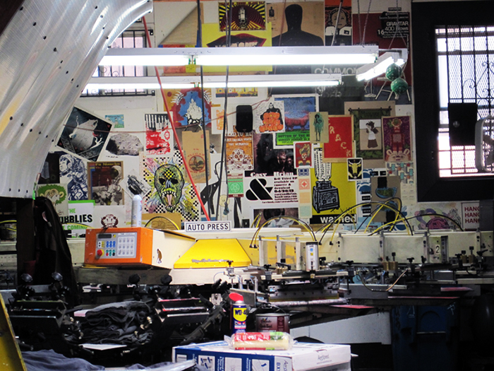
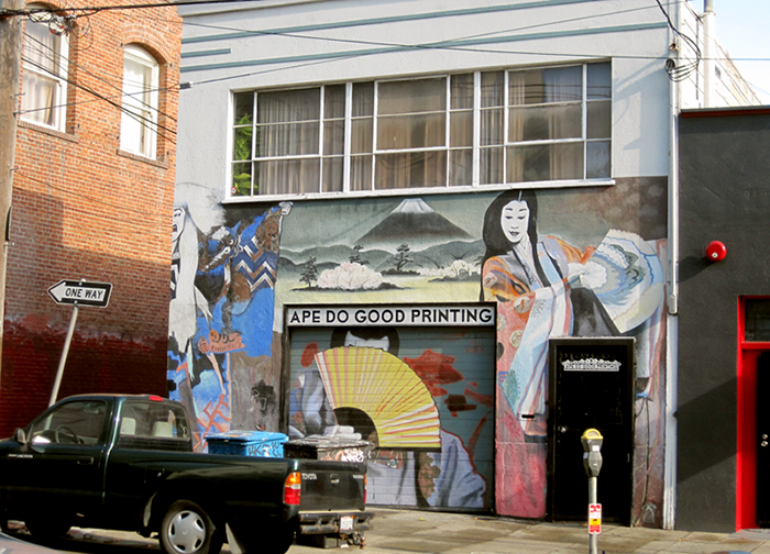
Jon works at Ape Do Good Printing, an artist run commercial silkscreen printing shop in the Mission district of San Francisco, while also independently producing his own beautiful silkscreen zines and projects.  Curious to get to know more about his process, motivation and upcoming projects we asked Jon to tell us a bit more about himself. 

inside ape

&PP: To start, can you tell us about how you began making zines and doing what you do?

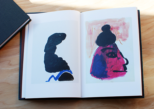
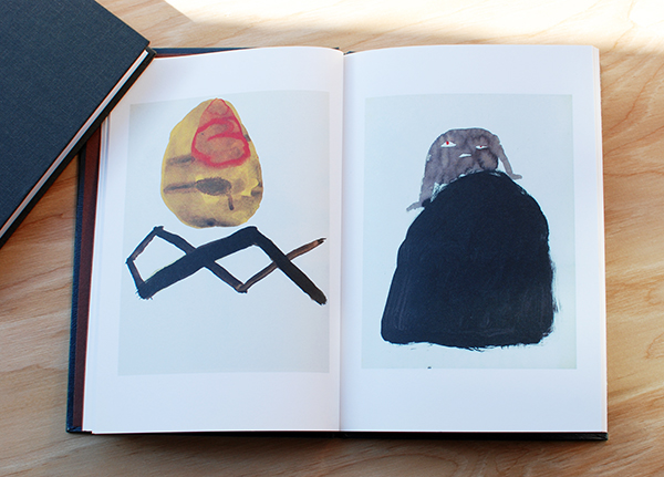
JC: I am a printmaker that makes art zines/books. The zines, notably Warm Up, are experiments with the screen printing medium and the book format.  My recent focus has been leaning towards abstraction with a focus on pattern work. I recently started screen printing and making art zines towards the end of 2012, but before that I was attending UC Santa Barbara for art. At Santa Barbara I was formally trained, but it wasn’t till the end of the school that I decided to pursue self-publication and focus more on printmaking. I recently picked up screen printing so I still feel pretty fresh to the medium, but at moment I have been thinking about creating film positives with analog means. As for art zines/books I am digging into the community and finding something I really enjoy; there’s so much there that it’s exciting to follow.

ape do good I spend a lot of time around screen printing so thinking about it in relation to my art is inevitable. 

ink rack
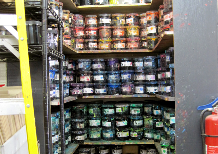
I try to take notice of colors that catch my attention when I’m around the shop. This helps me produce some interesting color schemes.

books
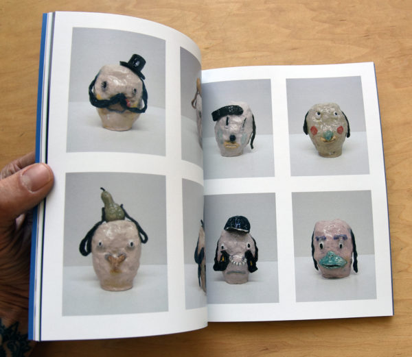
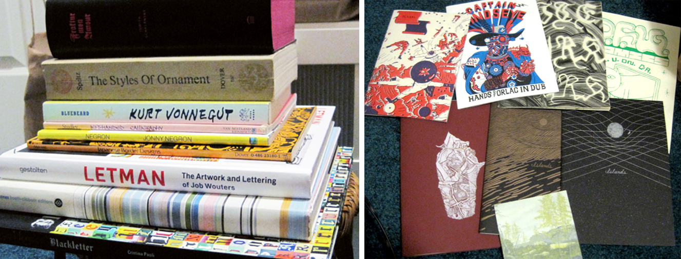
Here are some of my favorite zines and books in my collection. My most recent favorite find was Lite Murk by Cody Hoyt, printed by Visual Field Press. That Letman: The Art and Lettering of Job Wouters and Fraktur Mon Amour are also such awesome books.

DSC_0237 
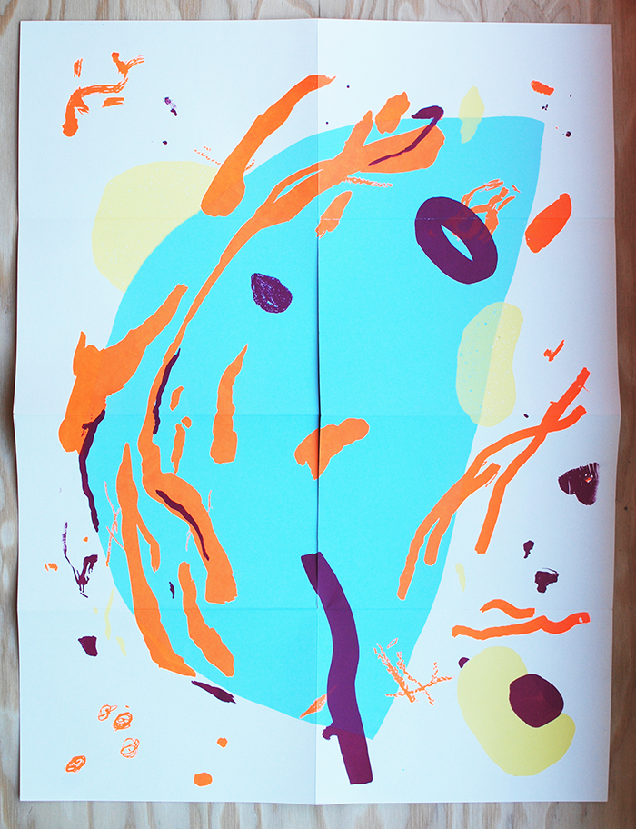
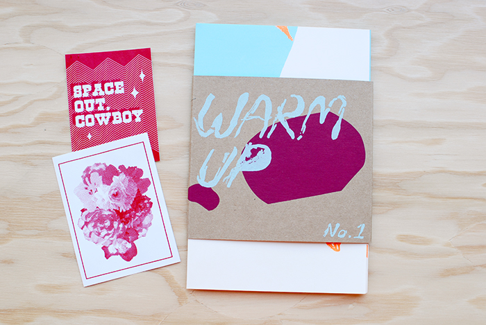
&PP: We love your latest publication Warm Up, it’s beautiful. Care to walk us through your inspiration and process?

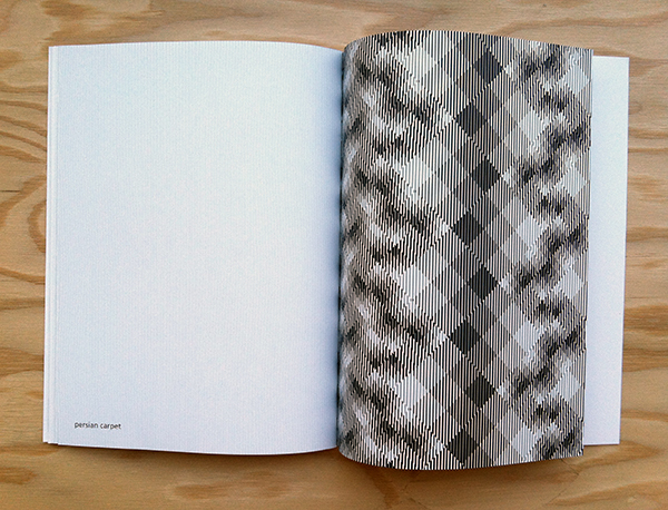
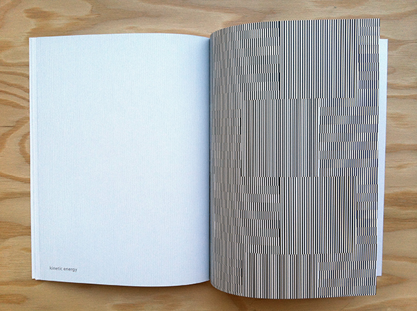
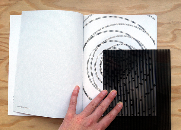
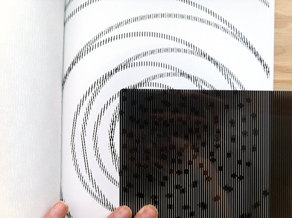
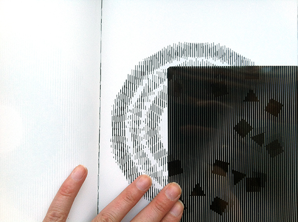
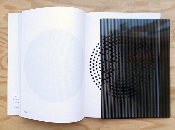
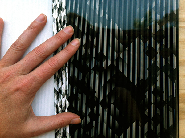
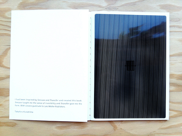
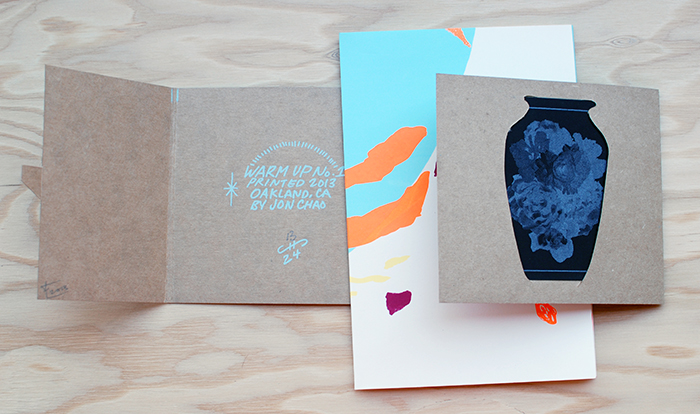
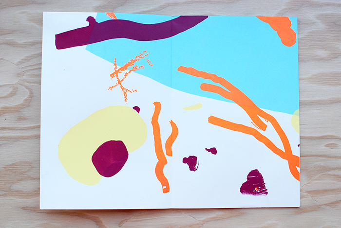
JC: The origin of Warm Up was a result of making mock ups for an 8 fold zine. It was with an old page covered with practice marks and strokes. I noticed how nice certain areas looked when focused from the full page. That event lead to the inspiration for the Warm Up series.

DSC_0239 
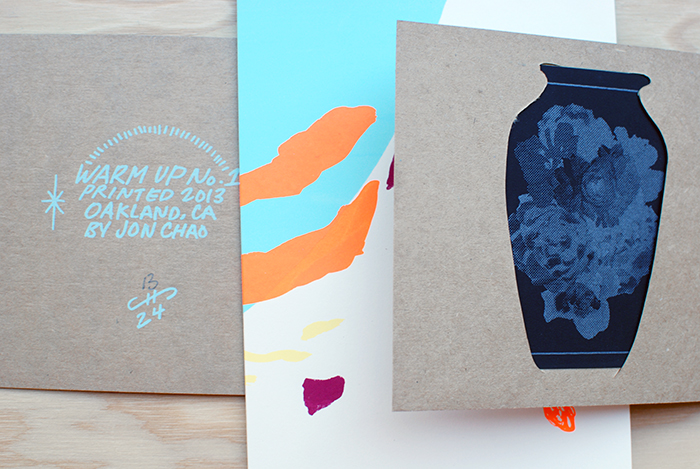
As for the process of composing the image, I created each layer as I went along and the process came organically. I experimented with making film positives through analog means and observed how certain materials and marks reacted when burned on the screen. I was curious about the results.

DSC_0242
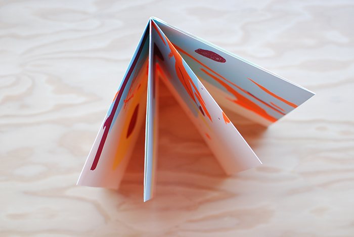
When preparing for Warm No. 1, I worked things out in my head and made preliminary thumbnail sketches. I hoped for the best when I printed, but left myself open to uncertain results and reactions. It was a real surprise with every layer, because I was loose with registering the different layers.  Even more surprised was when I finished folding the finished print into an 8 fold zine. I thought it was interesting that I was working from a large image that would later on be turned into a series of smaller images. It was kind of a backwards way of working.  I recently realized, as the maker of Warm Up, I was working to find out what the larger image will turn into as it is folded. Whereas, the viewer is working his or her way from the small folded image into the large unfolded full image. I like that.

DSC_0241 DSC_0245DSC_0247
&PP: What are you working on right now or have coming up in the future that you are looking forward to?

JC: In the near future you can expect two more different Warm Up editions. They will both be within a similar style of Warm Up No. 1, but focusing on different techniques in making screen positives.  Then after the editions, I’ll dig through my sketchbook for the next project, which will most likely be some kind of print. My mind set has been geared towards screen printing since I’m around it so often. I’m excited to see what happens later.

&PP: Thanks for your time Jon, we look forward to seeing your new projects!

Friday Favorite : Amalia Pica

It’s Friday! This week’s Friday Favorite post is on an exhibition catalog by the incredible London- based Argentinian artist, Amalia Pica. We’ve been fans of Pica’s work for awhile so when we heard about this publication coming out we couldn’t wait to get our hands on it. 

DSC_0255

The book began with her first major solo museum show, Amalia Pica at the MCA, where approximately fifteen of her most significant works from the last seven years, in addition to new commissions, were exhibited in the United States for the first time.

DSC_0257Incorporating simple everyday objects and celebratory signifiers of celebration such as fiesta lights, flags and banners, confetti, rainbows, photocopies, lightbulbs, drinking glasses, beer bottles and cardboard Pica’s work is optimistic, colorful, poetic and beautiful.

Pica’s work is directly dealing with that the translation of symbolic language and motivated by how meaning is created and deciphered between the artist and the viewer. 

DSC_0258

With a similar creative energy curators João Ribas of MIT List Visual Arts Center, and Julie Rodrigues Widholm of the MCA came together to spearhead the publication with the goal of giving an in-depth look at the last ten years of Pica’s work. During this time Pica worked in close collaborative dialogue for the design and editorial process. The result is a strong visual and text based overview of her  drawings, sculptures, large-scale photographic prints, slide projections, live performances and installations.

DSC_0259

DSC_0260

With 112 colorful pages,  foldout sections, radius-cut board cover with foil-blocked buckram spine and a yellow transparent PVC dust jacket the publication exudes a high level of visual, conceptual and textural stimulation. The design feels synonymous with Pica’s work, and makes for an enjoyable way to experience Pica’s work. Even the transparent greenish-yellow PVC dust jacket mimics Pica’s use of coloured gels within her work.

All in all this is a fun, interesting publication, and a perfect overview for those interested in learning more about Pica’s work. Highly recommended. 

Available for $30 in the & Pens Press online store here.

DSC_0261DSC_0256

Amalia Pica
Project: Exhibition catalogue
Publisher: MCA Chicago, Artbook | DAP
Format: 203.2 × 254 mm (8 × 10 in)
112 pages with foldout sections
Radius-cut board cover with foil-blocked buckram spine, yellow transparent PVC dust jacket
Curators: João Ribas (MIT List), Julie Rodrigues Widholm (MCA Chicago)
Director of Publications: Kate Steinmann
Editors: Lisa Meyerowitz, Molly Zimmerman-Feeley
Designers: James Goggin, Scott Reinhard
Printing: Die Keure, Bruges

The Timeless Interaction of Color

Josef Albers, the German-born artist and educator who taught at the Bauhaus, Black Mountain College and Yale University created Interaction of Color as a handbook and teaching aid for artists, instructors, and students.

For those who have experience with this book (by teaching from or learning from it) knows it is a timeless and mesmerizing resource for anyone interested in color theory and human perception. 

DSC_0227

Originally published by Yale University Press in 1963 as a limited silkscreen edition with 150 color plates, Interaction of Color first appeared in paperback in 1971, featuring ten color studies chosen by Albers, and has remained in print ever since.

With over a quarter of a million copies sold in its various editions since 1963, Interaction of Color has become a watershed on complex color theory principles and is as pioneering today as when Albers first created it.

DSC_0230

DSC_0231 DSC_0232 DSC_0233

Fifty years after Interaction of Colors’s initial publication, this new edition presents an expanded selection of close to sixty color studies alongside Albers’s original text, demonstrating such principles as color relativity, intensity, and temperature; vibrating and vanishing boundaries; and the illusion of transparency and reversed grounds.

DSC_0234  DSC_0236

To further celebrate the book’s 50th anniversary Yale University Press also released  a new way to engage with Albers’s lessons by releasing the “Interaction of Color” App for the iPad.

josef-albers-3-thumb-307x387-65189josef-albers-2-thumb-307x387-65191

The ($9.99) app combines the book’s text and color studies, video commentary, interviews and over 60 new interactive plates that enables users to try their own color experiments with color. 

While we strongly believe there is something essential to holding publications in your hand, feeling the stock and tooth of paper and seeing colors in changing light, this app is an exciting way for Alber’s teachings to reach new audiences in studios and classrooms and that we are unquestionably in favor for that. 

Purchase Interaction of Color by Josef Albers here
Visit the Yale Books website for more info on the Interaction of Color App.