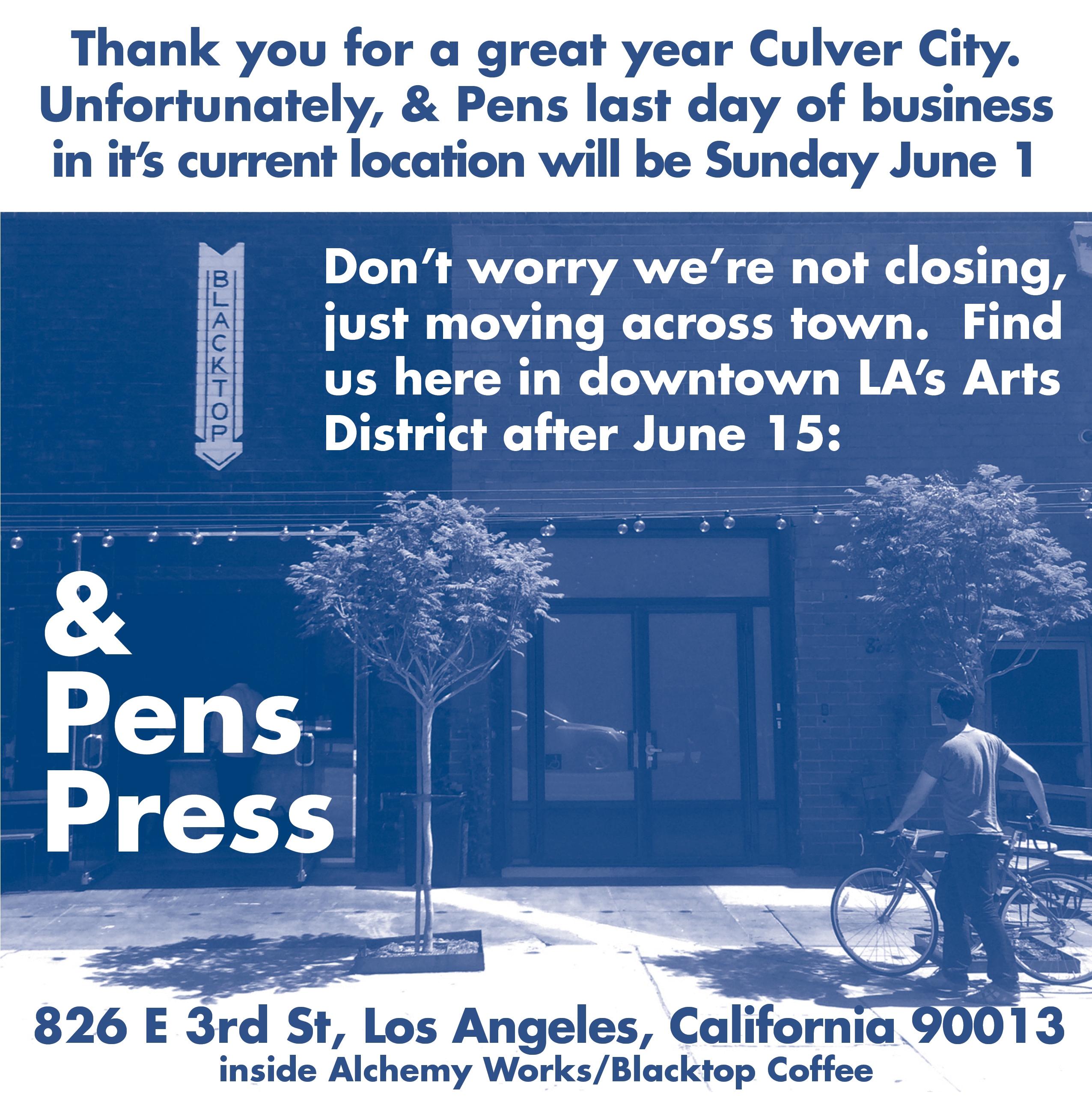
 *UPDATE: The downtown LA pop-up is moving to July. Stay tuned.
Images
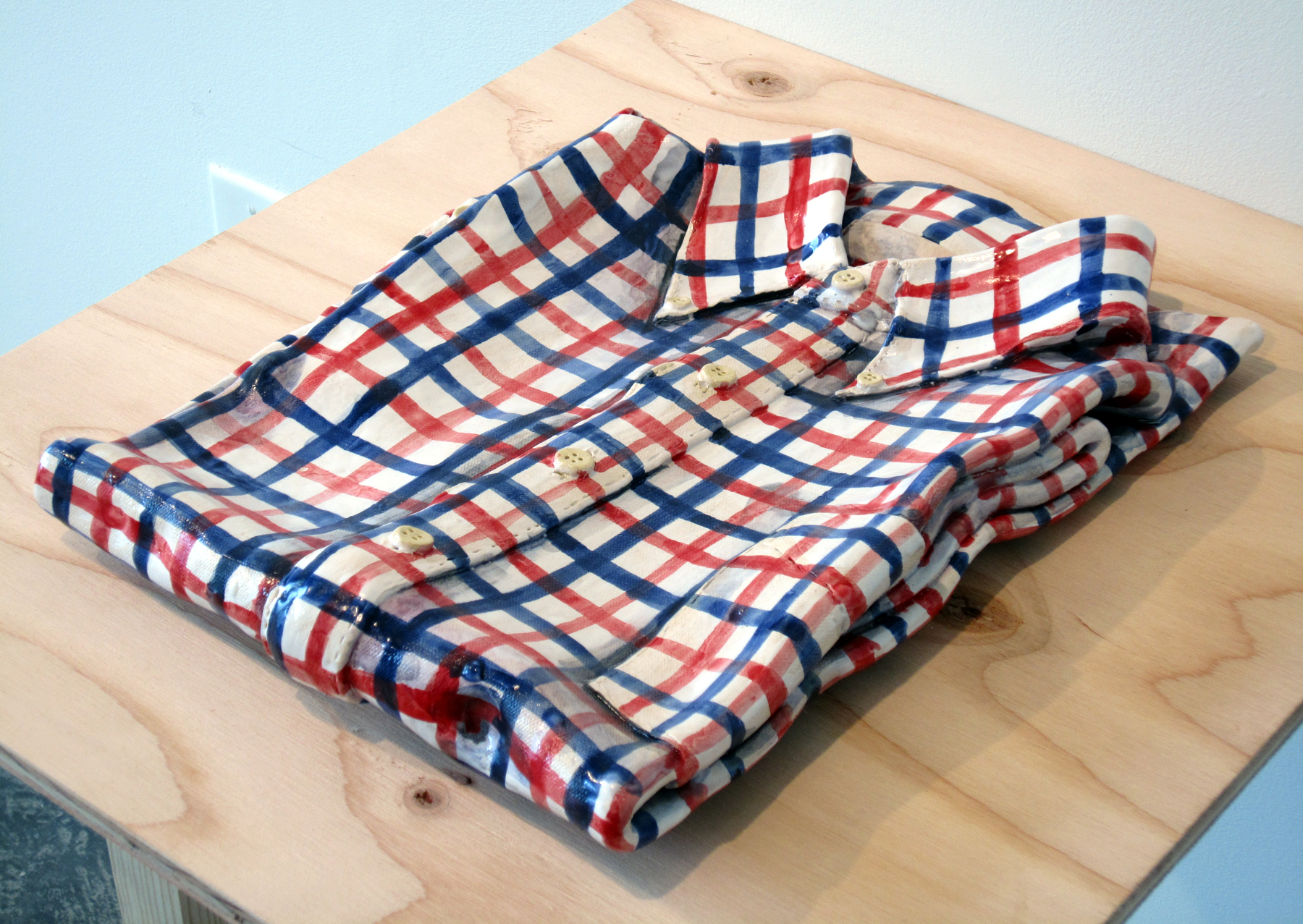
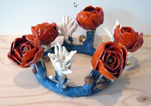
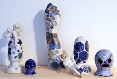
“For A Moment”, a solo exhibition by ceramicist Erik Scollon at & Pens
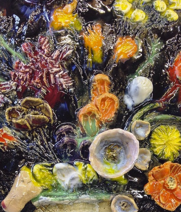
And Pens is pleased to announce “For A Moment” a solo show by Bay Area ceramic artist Erik Scollon. Join us on Saturday, February 15 from 7-9pm for the opening reception. The exhibition runs from Saturday, February 15 through March 10, 2014.
Press Release:
“For A Moment” extends the meditation on embodied presence and its relation to memory that was begun in “A Moment Lasts Forever Until it’s Gone” at Romer Young Gallery in San Francisco. The objects in “For A Moment” are things creatively borrowed from vanitas paintings as an engine of renewal, as well as reminding us of the importance of the ephemeral lived in moment of the present. The objects simultaneously open up and close down bodily awareness and preservation of memory. The act of securing memory embodies everything you need it to, while not really holding on to any of it, returning you back to the importance of the sensorial experience of here and now.
About the Artist:
ERIK SCOLLON is an artist and writer based in Oakland, California. In 2008 he was selected to participate in YBCA’s Bay Area Now 5, and his work has been seen in venues as diverse as art galleries, craft fairs, museum shows, design blogs and gay biker bars. He recived an MFA in ceramics and an MA in Visual and Critical Studies, both from California College of the Arts. Along with Amanda Curreri, he is the co-editor and co-founder of an (ir)regular artist publication, Color&Color, which aims to tactically connect artists with new audiences and expanded dialogue through the serial print medium of small books.
More of Scollon’s work can be view here:
Romer Young Gallery
and on his website:
erikscollon.tumblr
Hamburger Eyes Tonight!
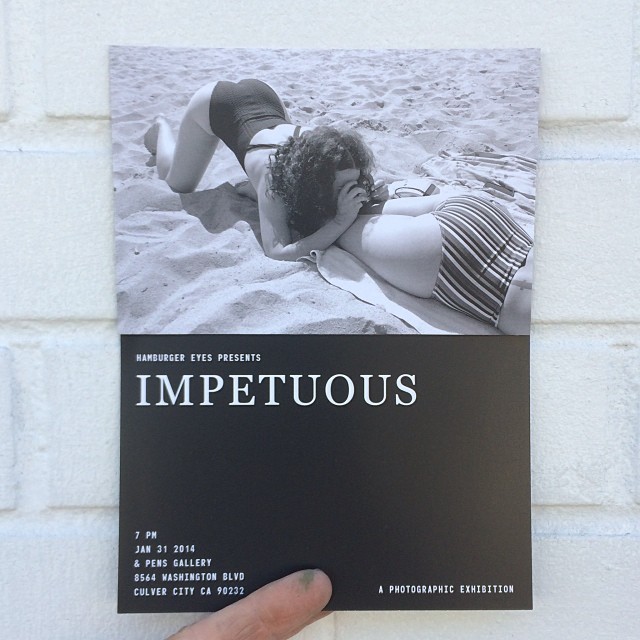
Coming Soon – Hamburger Eyes

& Pens Press Internships
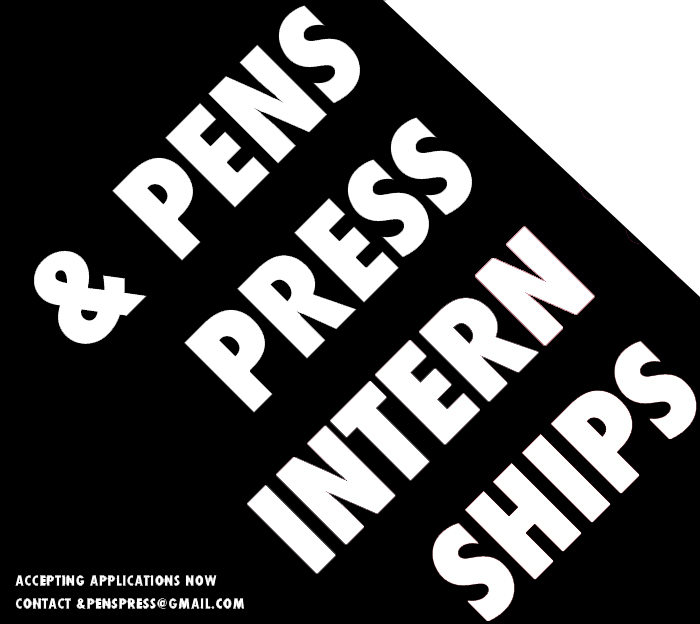
& PENS PRESS is now accepting applications for fall internships. If you are interested please email your resume and cover letter describing why you would like to work with us to andpenspress@gmail.com.
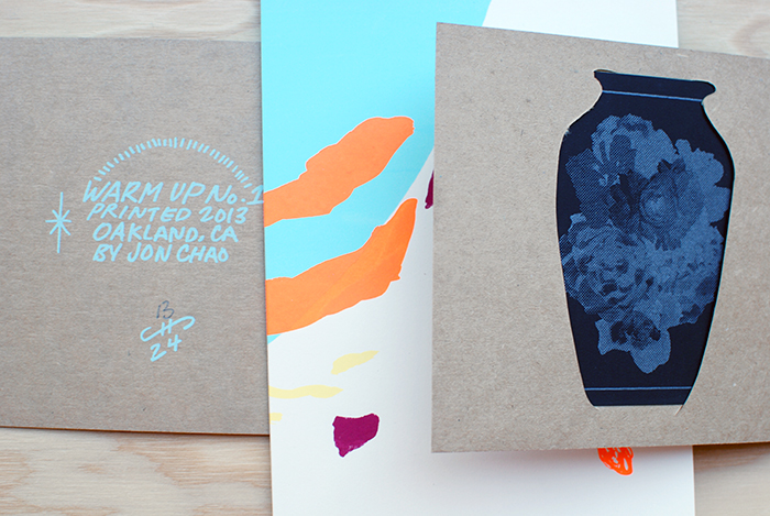
Get to Know : Jonathan Chao
Please welcome our first featured artist on the blog Jonathan Chao from Oakland, California.
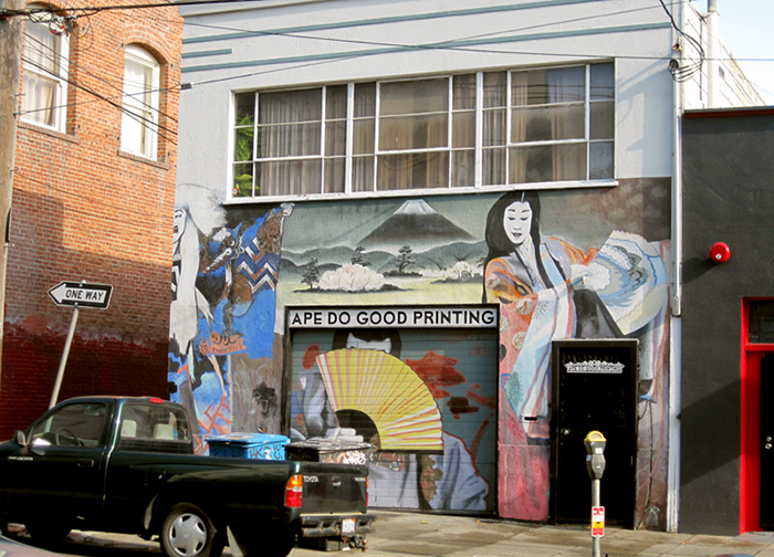
Jon works at Ape Do Good Printing, an artist run commercial silkscreen printing shop in the Mission district of San Francisco, while also independently producing his own beautiful silkscreen zines and projects. Curious to get to know more about his process, motivation and upcoming projects we asked Jon to tell us a bit more about himself.

&PP: To start, can you tell us about how you began making zines and doing what you do?
JC: I am a printmaker that makes art zines/books. The zines, notably Warm Up, are experiments with the screen printing medium and the book format. My recent focus has been leaning towards abstraction with a focus on pattern work. I recently started screen printing and making art zines towards the end of 2012, but before that I was attending UC Santa Barbara for art. At Santa Barbara I was formally trained, but it wasn’t till the end of the school that I decided to pursue self-publication and focus more on printmaking. I recently picked up screen printing so I still feel pretty fresh to the medium, but at moment I have been thinking about creating film positives with analog means. As for art zines/books I am digging into the community and finding something I really enjoy; there’s so much there that it’s exciting to follow.
 I spend a lot of time around screen printing so thinking about it in relation to my art is inevitable.
 I try to take notice of colors that catch my attention when I’m around the shop. This helps me produce some interesting color schemes.
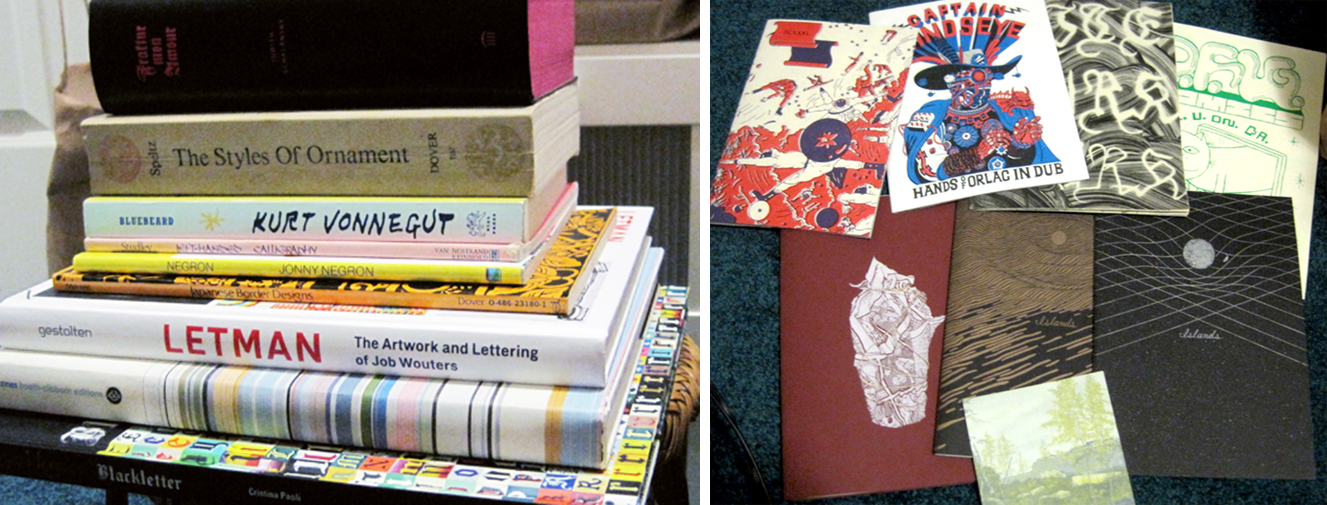
Here are some of my favorite zines and books in my collection. My most recent favorite find was Lite Murk by Cody Hoyt, printed by Visual Field Press. That Letman: The Art and Lettering of Job Wouters and Fraktur Mon Amour are also such awesome books.
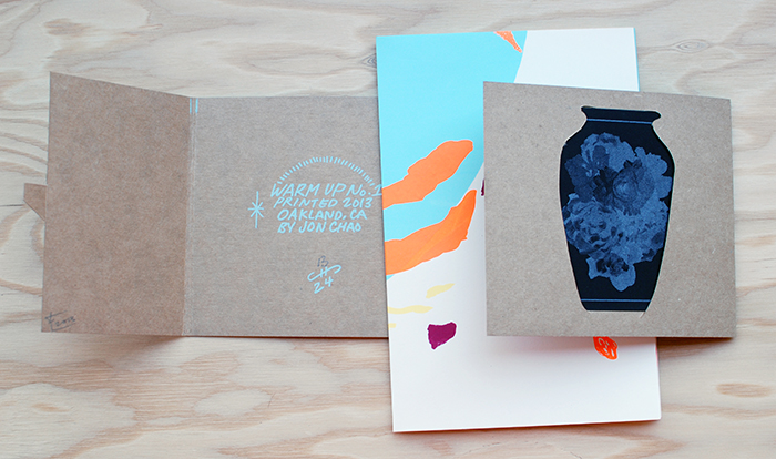
 &PP: We love your latest publication Warm Up, it’s beautiful. Care to walk us through your inspiration and process?
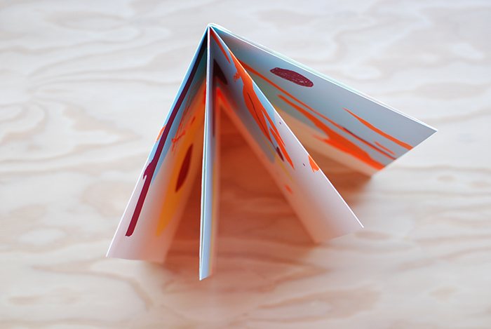
JC: The origin of Warm Up was a result of making mock ups for an 8 fold zine. It was with an old page covered with practice marks and strokes. I noticed how nice certain areas looked when focused from the full page. That event lead to the inspiration for the Warm Up series.
 As for the process of composing the image, I created each layer as I went along and the process came organically. I experimented with making film positives through analog means and observed how certain materials and marks reacted when burned on the screen. I was curious about the results.
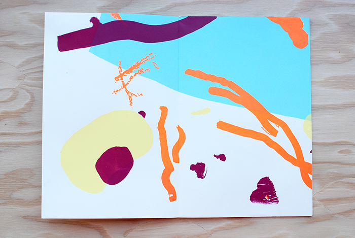 When preparing for Warm No. 1, I worked things out in my head and made preliminary thumbnail sketches. I hoped for the best when I printed, but left myself open to uncertain results and reactions. It was a real surprise with every layer, because I was loose with registering the different layers. Even more surprised was when I finished folding the finished print into an 8 fold zine. I thought it was interesting that I was working from a large image that would later on be turned into a series of smaller images. It was kind of a backwards way of working. I recently realized, as the maker of Warm Up, I was working to find out what the larger image will turn into as it is folded. Whereas, the viewer is working his or her way from the small folded image into the large unfolded full image. I like that.

&PP: What are you working on right now or have coming up in the future that you are looking forward to?
JC: In the near future you can expect two more different Warm Up editions. They will both be within a similar style of Warm Up No. 1, but focusing on different techniques in making screen positives. Then after the editions, I’ll dig through my sketchbook for the next project, which will most likely be some kind of print. My mind set has been geared towards screen printing since I’m around it so often. I’m excited to see what happens later.
&PP: Thanks for your time Jon, we look forward to seeing your new projects!
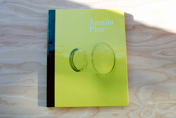
Friday Favorite : Amalia Pica
It’s Friday! This week’s Friday Favorite post is on an exhibition catalog by the incredible London- based Argentinian artist, Amalia Pica. We’ve been fans of Pica’s work for awhile so when we heard about this publication coming out we couldn’t wait to get our hands on it.
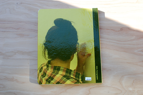
The book began with her first major solo museum show, Amalia Pica at the MCA, where approximately fifteen of her most significant works from the last seven years, in addition to new commissions, were exhibited in the United States for the first time.
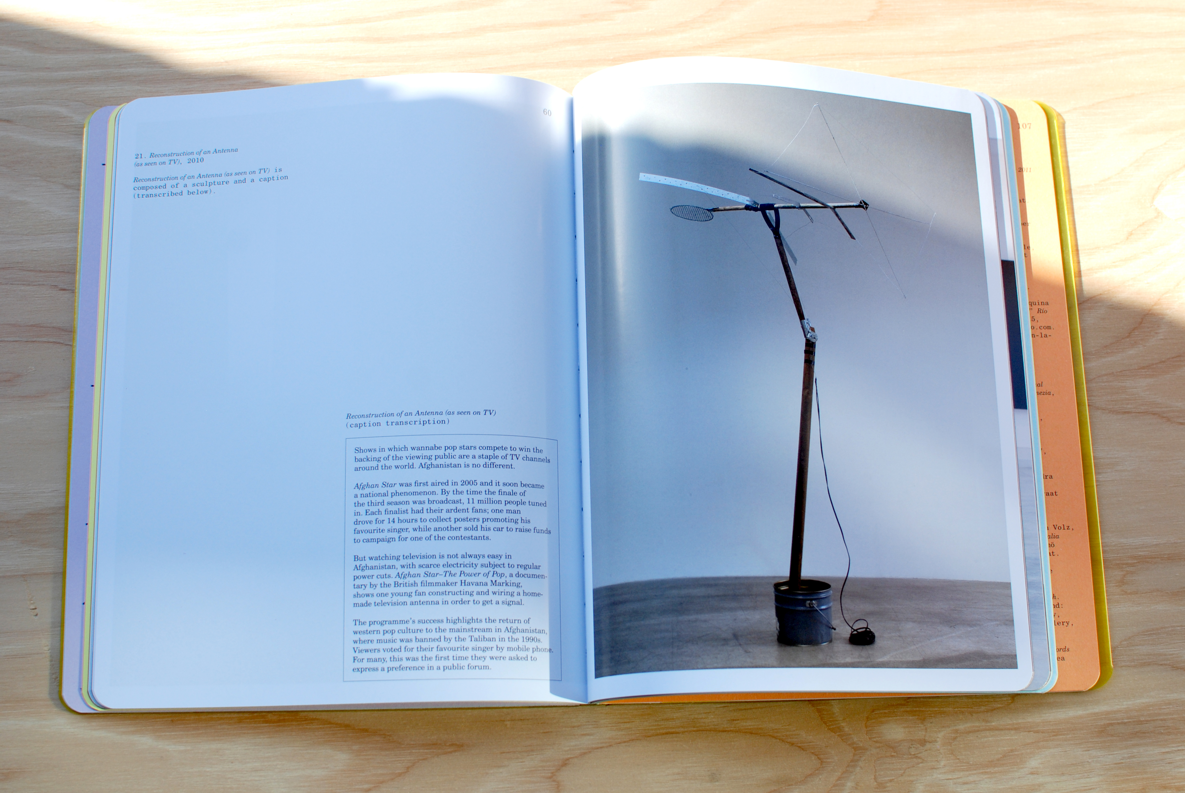
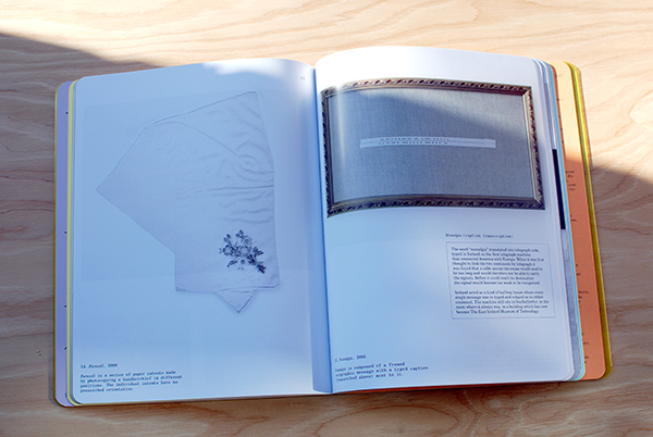
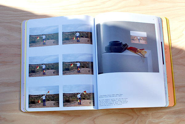
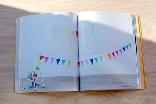
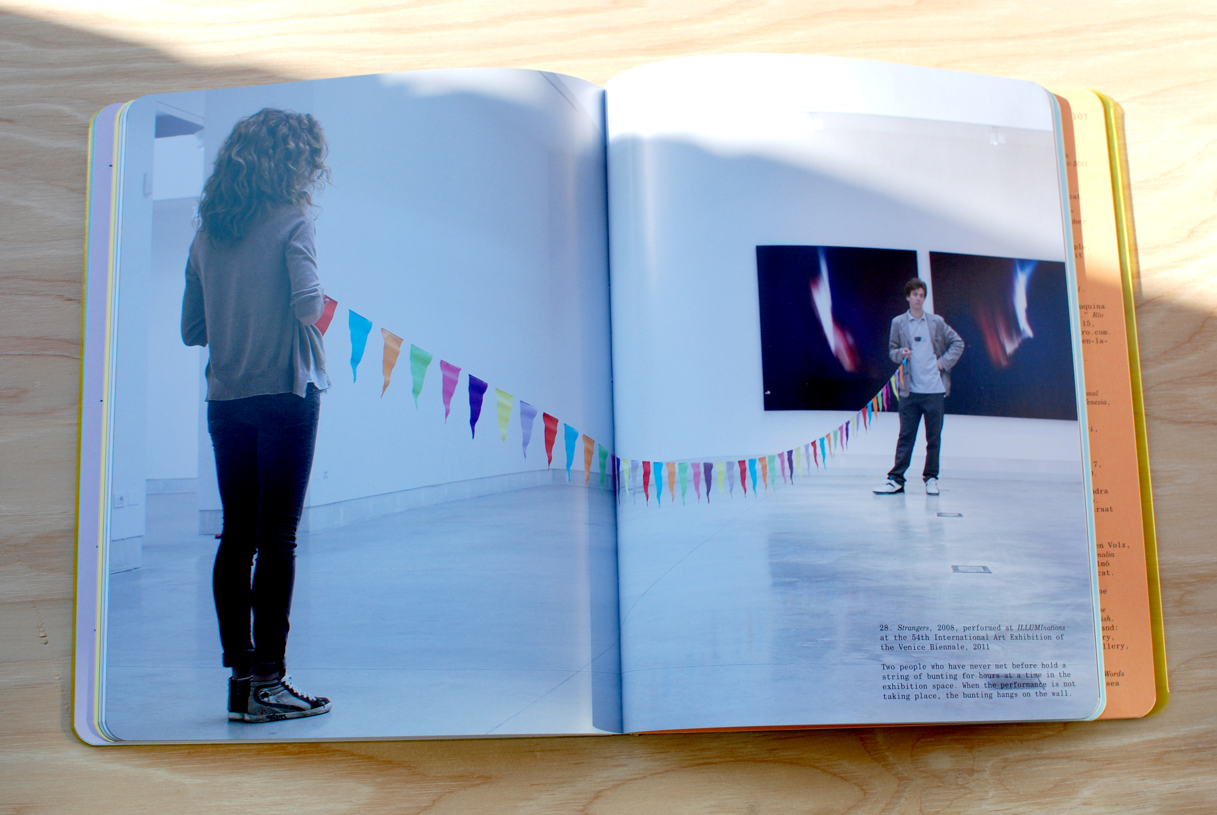 Incorporating simple everyday objects and celebratory signifiers of celebration such as fiesta lights, flags and banners, confetti, rainbows, photocopies, lightbulbs, drinking glasses, beer bottles and cardboard Pica’s work is optimistic, colorful, poetic and beautiful.
Pica’s work is directly dealing with that the translation of symbolic language and motivated by how meaning is created and deciphered between the artist and the viewer.
With a similar creative energy curators João Ribas of MIT List Visual Arts Center, and Julie Rodrigues Widholm of the MCA came together to spearhead the publication with the goal of giving an in-depth look at the last ten years of Pica’s work. During this time Pica worked in close collaborative dialogue for the design and editorial process. The result is a strong visual and text based overview of her drawings, sculptures, large-scale photographic prints, slide projections, live performances and installations.
With 112 colorful pages, foldout sections, radius-cut board cover with foil-blocked buckram spine and a yellow transparent PVC dust jacket the publication exudes a high level of visual, conceptual and textural stimulation. The design feels synonymous with Pica’s work, and makes for an enjoyable way to experience Pica’s work. Even the transparent greenish-yellow PVC dust jacket mimics Pica’s use of coloured gels within her work.
All in all this is a fun, interesting publication, and a perfect overview for those interested in learning more about Pica’s work. Highly recommended.
Available for $30 in the & Pens Press online store here.
Amalia Pica
Project: Exhibition catalogue
Publisher: MCA Chicago, Artbook | DAP
Format: 203.2 × 254 mm (8 × 10 in)
112 pages with foldout sections
Radius-cut board cover with foil-blocked buckram spine, yellow transparent PVC dust jacket
Curators: João Ribas (MIT List), Julie Rodrigues Widholm (MCA Chicago)
Director of Publications: Kate Steinmann
Editors: Lisa Meyerowitz, Molly Zimmerman-Feeley
Designers: James Goggin, Scott Reinhard
Printing: Die Keure, Bruges
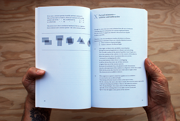
The Timeless Interaction of Color
Josef Albers, the German-born artist and educator who taught at the Bauhaus, Black Mountain College and Yale University created Interaction of Color as a handbook and teaching aid for artists, instructors, and students.
For those who have experience with this book (by teaching from or learning from it) knows it is a timeless and mesmerizing resource for anyone interested in color theory and human perception.
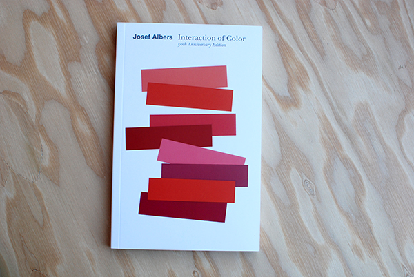
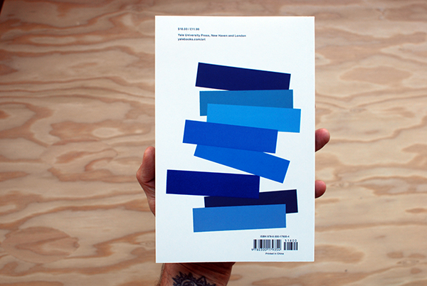
Originally published by Yale University Press in 1963 as a limited silkscreen edition with 150 color plates, Interaction of Color first appeared in paperback in 1971, featuring ten color studies chosen by Albers, and has remained in print ever since.
With over a quarter of a million copies sold in its various editions since 1963, Interaction of Color has become a watershed on complex color theory principles and is as pioneering today as when Albers first created it.
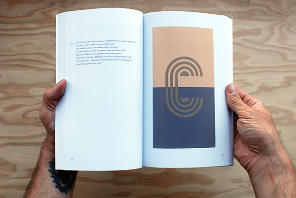

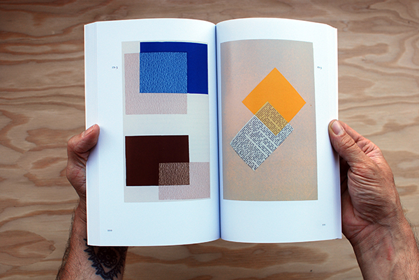

Fifty years after Interaction of Colors’s initial publication, this new edition presents an expanded selection of close to sixty color studies alongside Albers’s original text, demonstrating such principles as color relativity, intensity, and temperature; vibrating and vanishing boundaries; and the illusion of transparency and reversed grounds.
To further celebrate the book’s 50th anniversary Yale University Press also released a new way to engage with Albers’s lessons by releasing the “Interaction of Color” App for the iPad.
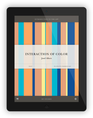
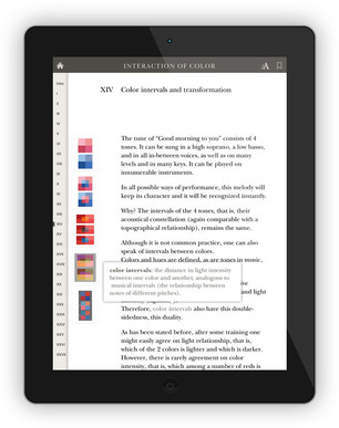
The ($9.99) app combines the book’s text and color studies, video commentary, interviews and over 60 new interactive plates that enables users to try their own color experiments with color.
While we strongly believe there is something essential to holding publications in your hand, feeling the stock and tooth of paper and seeing colors in changing light, this app is an exciting way for Alber’s teachings to reach new audiences in studios and classrooms and that we are unquestionably in favor for that.
Purchase Interaction of Color by Josef Albers here.
Visit the Yale Books website for more info on the Interaction of Color App.
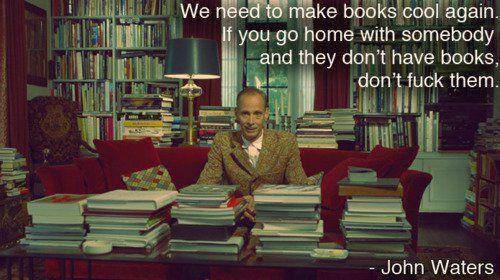
Store Visit: John Waters
John Waters stopped by the & Pens Press store yesterday.
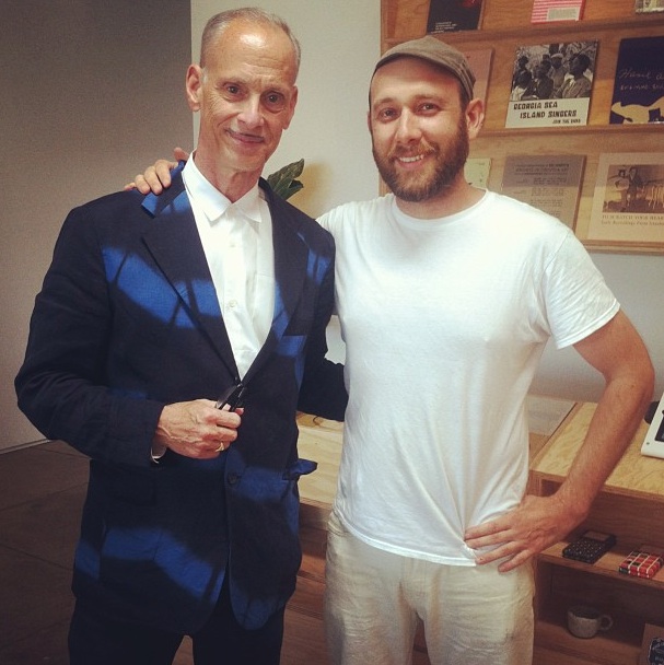
What a pleasure.
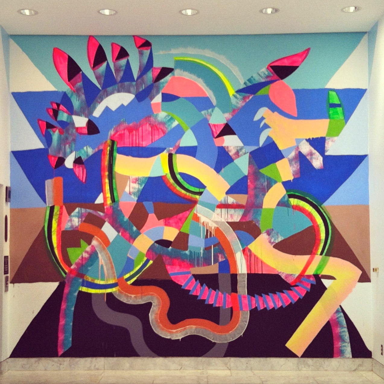
Maya Hayuk at the Hammer
This past Friday we got a chance to see the newly completed Maya Hayuk murals at the Hammer Museum. They are beautiful and should definitely be experienced in person.
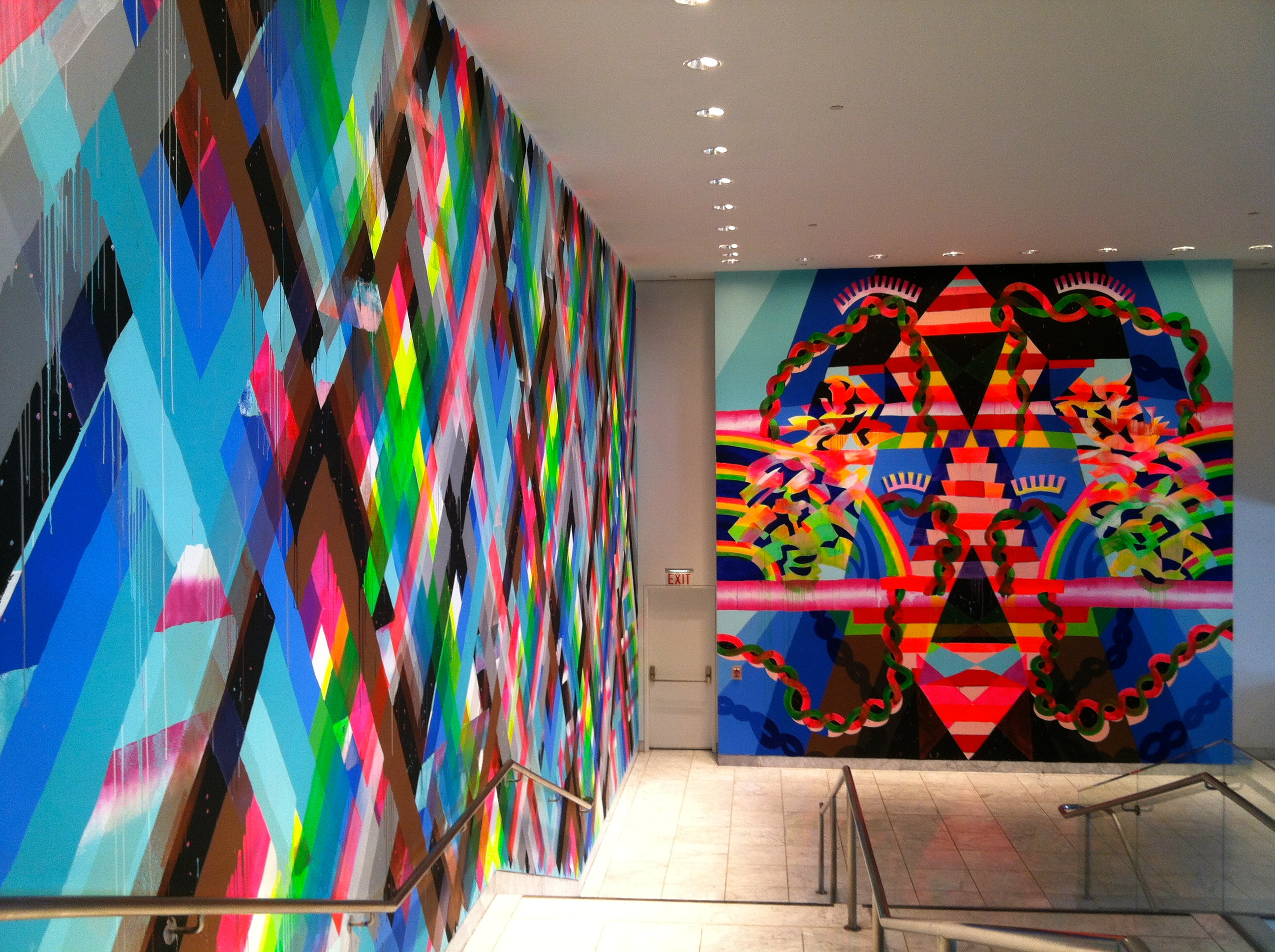
This smaller mural at the top of the stairs might have been my favorite.
Going hand in hand with Hayuk’s work was Generationalpictomusicapolis, a night of psychedelic sounds, organized by curator Darren Klein, featuring No Age, Sun Foot and Devin Gary & Ross.
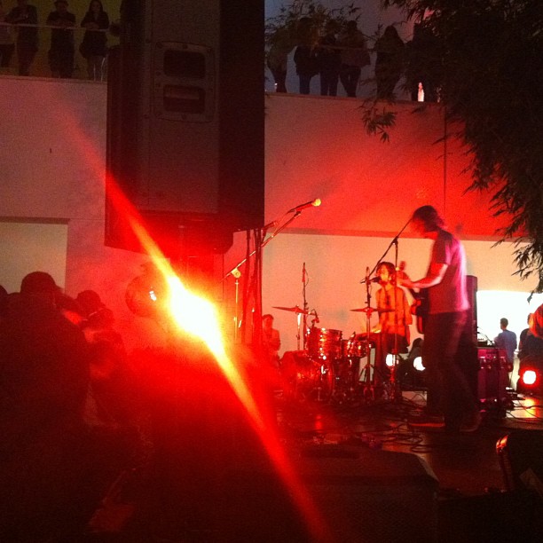 Coincidentally it was the first night of No Age’s tour which lead to much excitement. Good times all around that evening.